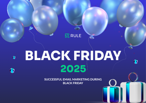
How good are your newsletters? At the beginning of the summer, we invited a number of students from our “Design Camp” to analyze ten newsletters from different clients operating in different industries, ranging from fashion to technology and experiences. The results are clear: small, smart improvements can make a big difference to opens, clicks and sales.
Here we share the most common mistakes – and our top tips on how to fix them!
1. put a headline that captures immediately
Common mistake: Many letters had only the company name as the heading or a too generic heading.
Do this: Spend time on a headline that arouses curiosity and reflects the content. Think: concrete, emotional or promising.
Rule Tips: Change headlines and test variations easily in our drag & drop editor. Use our AI feature in the editor for more inspiration and variation on headlines.
2. Keep the design together
Common mistake: Crisp fonts, too many colors, and mixed image styles make the newsletter cluttered.
Do this: Use a maximum of 2 fonts and a uniform color palette. Let the images speak the same language and use whitespace.
Rule Tip: Create your own templates and save your brand assets in Rules Brand Style feature to keep a consistent style that matches your brand.
3. Show your expertise
Common miss: Texts were often ‘too generic’, with a tone that felt AI-generated. Many newsletters lacked concrete details or unique insights.
Do this: Dare to geek out! Highlight what only you know – material choices, behind the scenes or specialist tips.
Rule Tips: Put in personalized blocks with tips or expert quotes from someone knowledgeable to build trust.
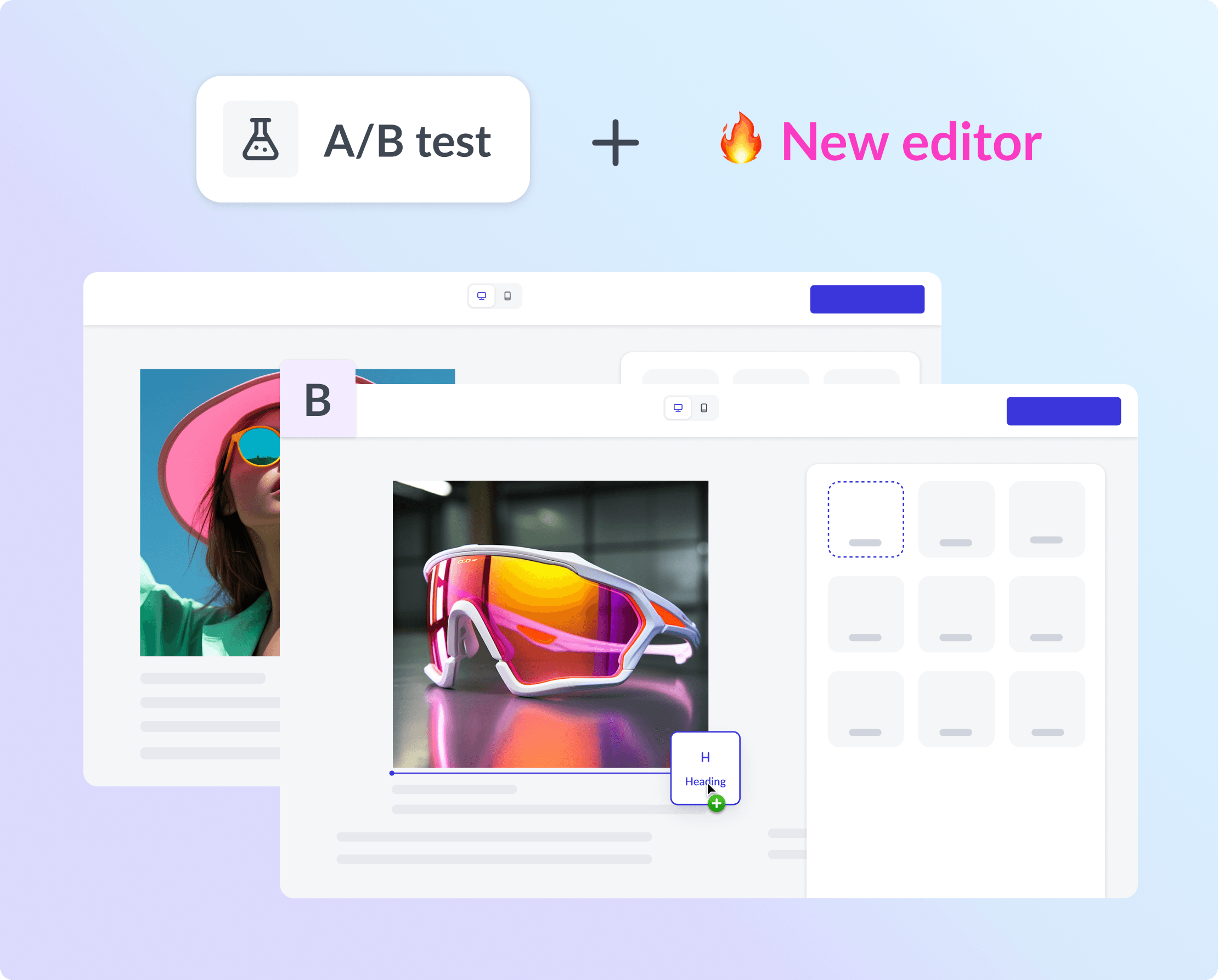
4. Lifting the CTA
Common mistake: Important buttons were far down or disappeared in the flow.
Do this: Place your main call to action (CTA) high up. Repeat further down for long letters.
Rule Tip: A/B test your mailings with our updated A/B test feature and try placing buttons in different places to see what has the best effect.
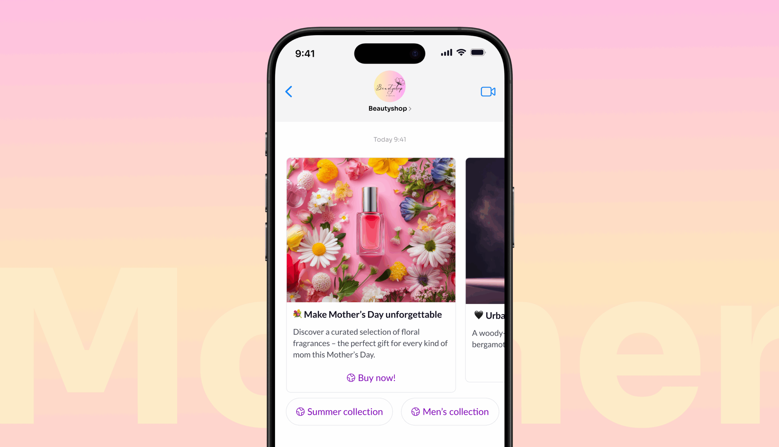
5. Choose the right images
Common miss: Generic images that tell nothing about the content. Students suggested more people and context!
Do this: Choose images that evoke emotions and show the product in use. Think: “What does the picture help the reader to understand?”
Rule Tip: Use the image library in Rule and sort into image folders to keep a consistent look.
6. Keep it short and sweet
Common mistake: Long introductions and unnecessary fluff lose the reader’s interest.
Do this: Write for the skim reader. Use short paragraphs, clear subheadings and bullet points.
Rule Tips: Split the text into blocks and test different versions with our updated A/B testing feature.
7. always go mobile!
Common mistake: Images and buttons looked good on desktop but worked worse on mobile.
Do this: Think mobile first! Short texts, large click-through areas and clear CTAs.
Rule Tip: Always see a live preview of the mobile version directly in our editor.
Checklist - do a quick self-analysis!
When you set up your newsletters, go through this list:
- Does the headline grab you right away?
- Is the design consistent and appealing?
- Is your expertise visible?
- Is the CTA high up?
- Are the images relevant and engaging?
- Is the text easy to skim?
- Does everything work on your mobile?
Want to take the next step? Book a workshop!
Analysis is just the beginning – the next step is to actually do the work and create newsletters that people both open and click on. Do you need support along the way? We offer customized workshops where we go through your mailings, brainstorm ideas and strategies, and help you build smart communication flows directly in Rule. Find out more and book your workshop here.
Good luck with your newsletters!